5 Food Styling Tips to Make your Photos Pop – Taking beautiful food photos is definitely harder than it looks. Here are some simple things that you can do to make your food photos stand out in the crowd.
Sharing recipes is a great way to drive traffic to your site. Everyone is looking for new food ideas, and sharing recipes is a great way to engage with your audience, regardless of your niche.
Taking drool-worthy shots of food can be harder than it looks. It isn’t the same as taking pictures of people. I often joke that it is easy to connect with a 3 year old and get a great shot, but that it isn’t quite as easy to do with a chicken breast.
Through the years I have picked up some tips that elevate the look and feel of food pictures with some simple styling.
5 Food Styling Tips to Make Your Photos Pop
Give your Photos a Sense of Place
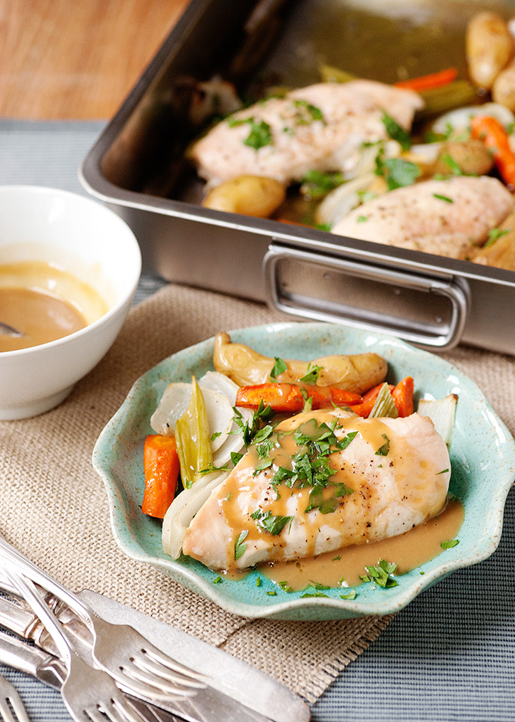
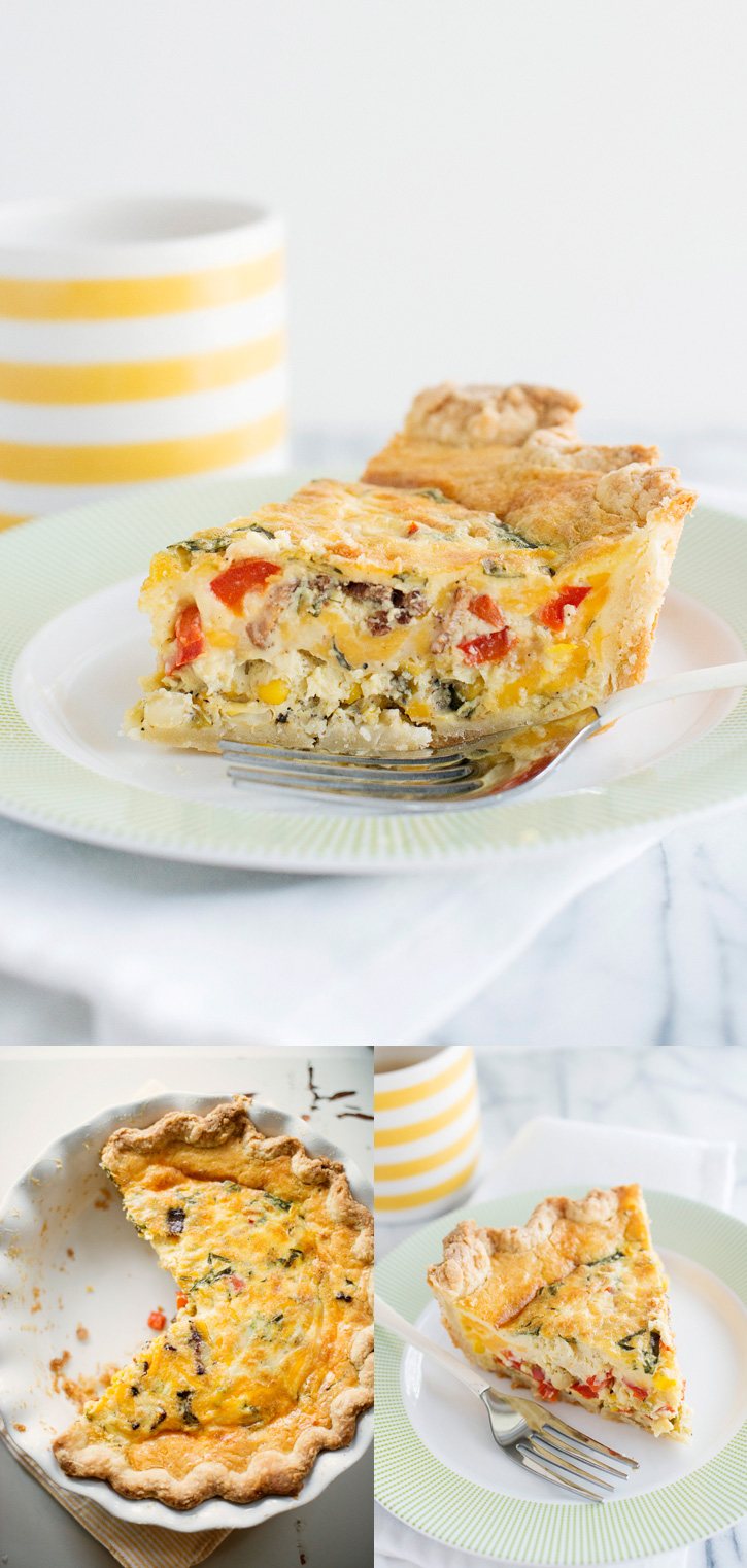
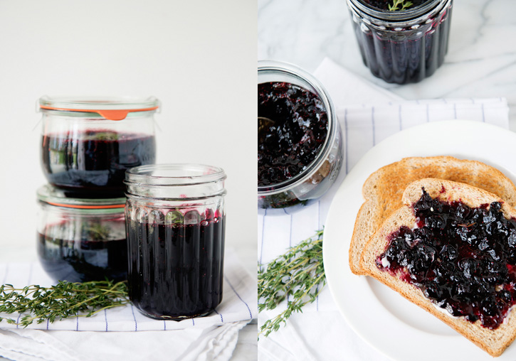
Make the viewer feel that they are sitting at the table with you engaged in the meal. That might mean a crumpled napkin, a drink, utensils on the side of the plate, broken bread, or a coffee cup. Avoid placing a plate on a surface with nothing else around it. Create atmosphere.
Use Different Angles
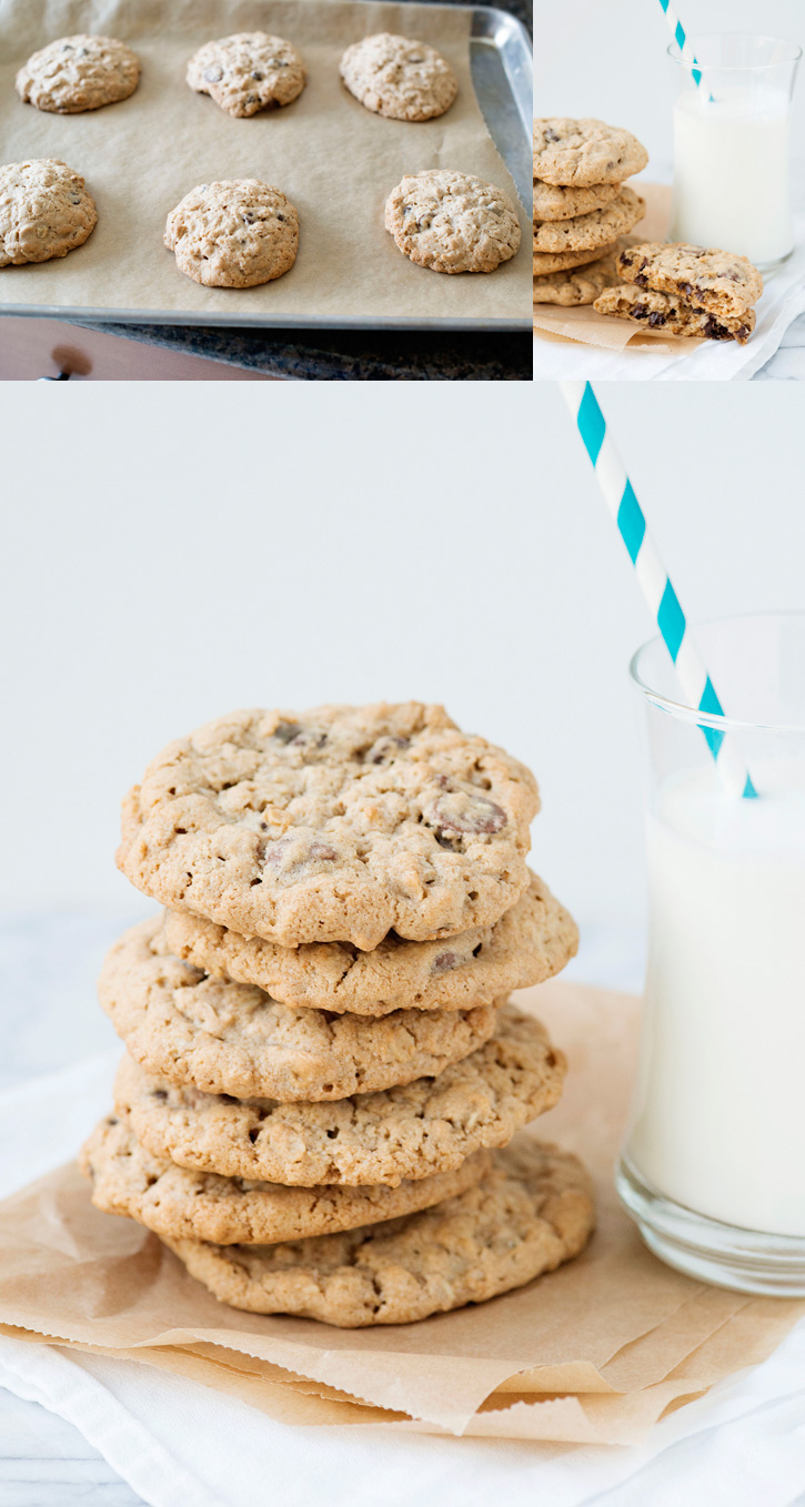
Take these cookies for example. They are flat and brown on a baking sheet. Boring. While delicious, they lack personality and dimension. To add dimension, try stacking the cookies on top of each other, or shooting straight down on the cookie sheet (this works best when the cookies are close together and there are a lot of them).
Try breaking the cookies in half to show the texture on the inside, or take a bite out of it. Shoot it with a glass of milk and a straw to add a pop of color.
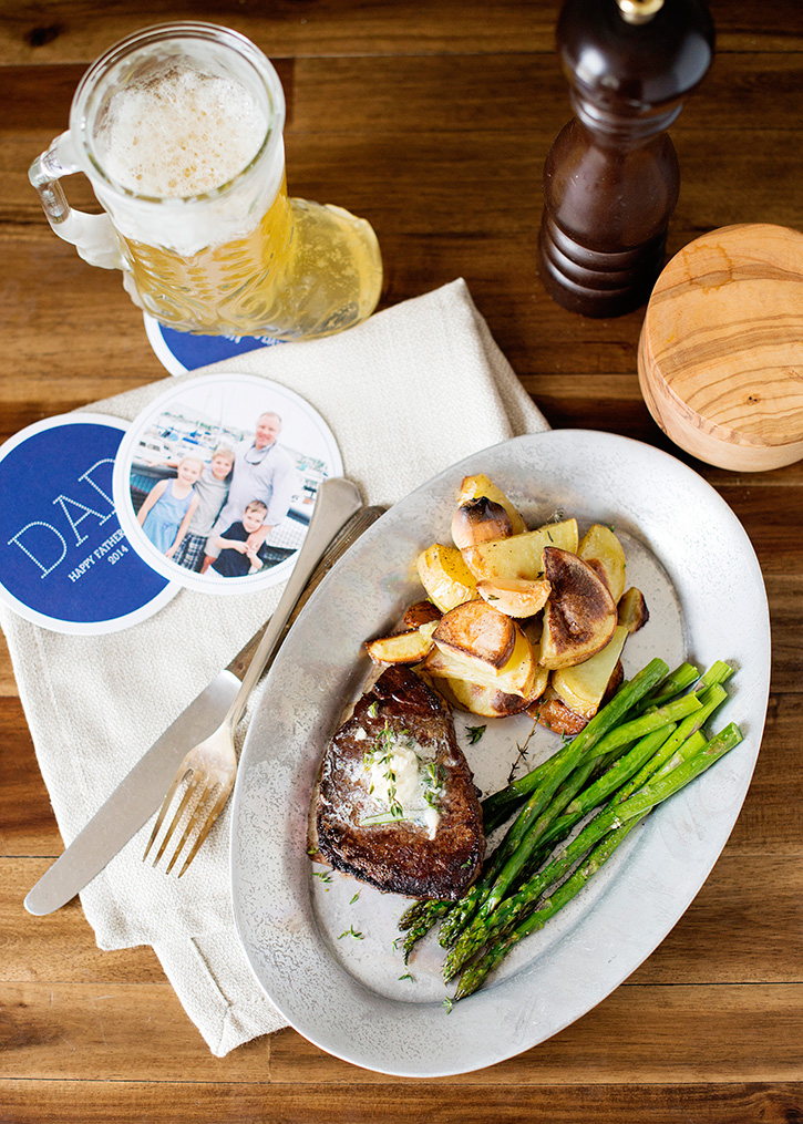
A general rule is to shoot straight on, ¾, and overhead.
Use Smaller Plates
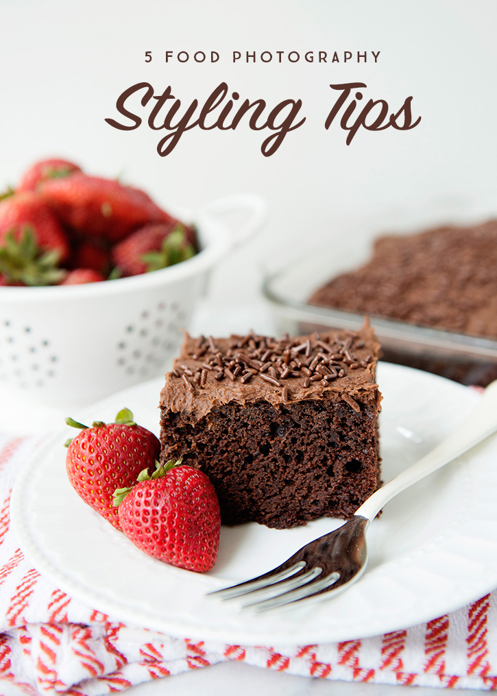
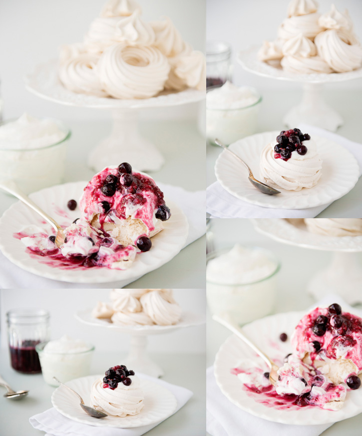
Food can look like it is swimming on a deserted island on a dinner plate. Use a salad plate instead. The food will fill the plate and look abundant. Speaking of plates, make sure that the pattern or color on your plate doesn’t compete with the food. The food should be the focal point and the star of the show.
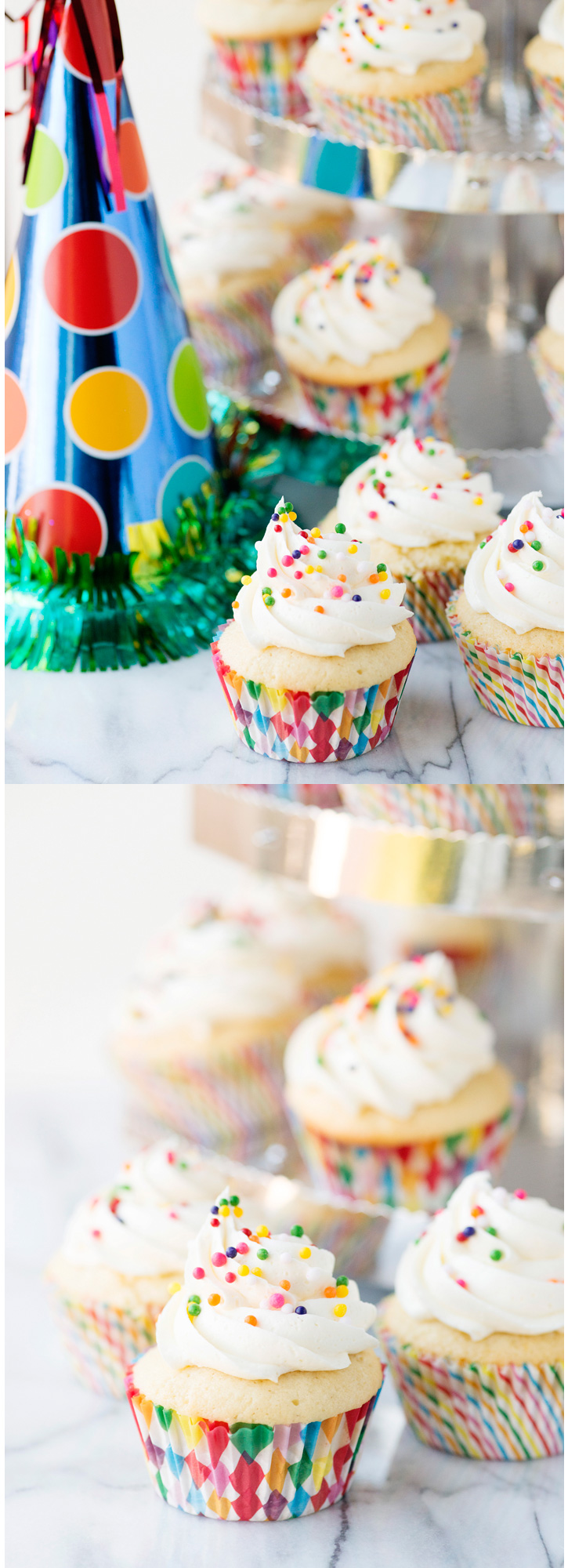
(This cake stand is very small, for a 6-7inch cake. The plates are also very small, it is a bread plate.)
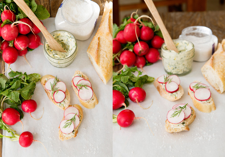
Shoot things in groups of 3 or 5
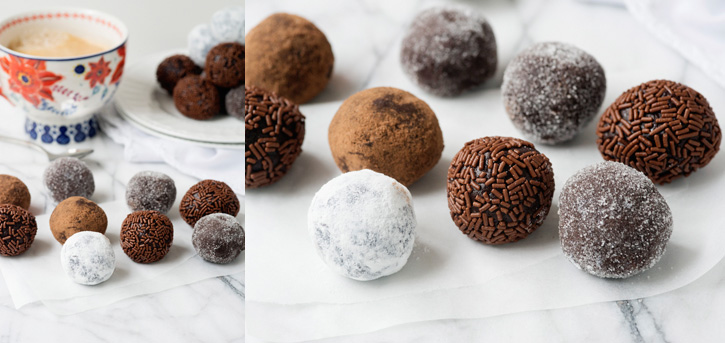
Arrange things in a triangular shape. Your eye will naturally flow around the image in a triangle.
Brand your images
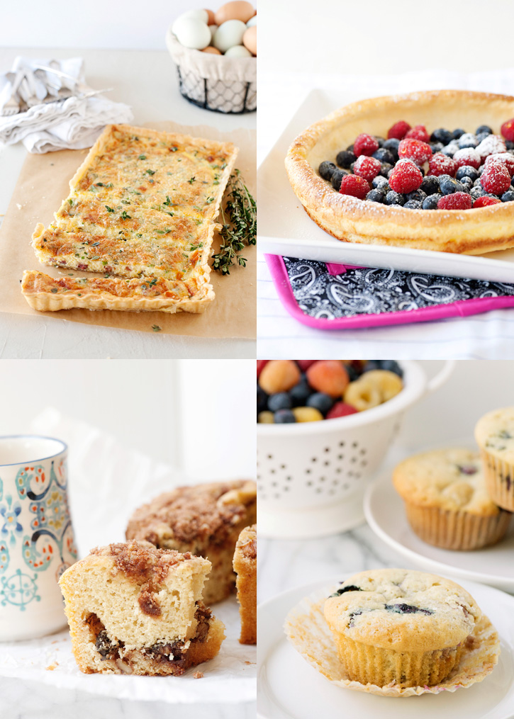
Brand you images just like you would anything else on your website. Having a distinctive style can help set yourself apart. One of my goals is for my readers to be able to pick out my photos in a lineup (i.e. Pinterest). I like a clean, simple, light look. You might like backlit, colorful, moody, close-ups, whatever you love, keep it consistent.
A few simple things that you can do to improve your food photos. My best piece of advice – start a collection or a board of photos that you like and draw inspiration from them. What do you like about them? What makes the picture interesting? Use it as your guide to create your own stunning images.
If you liked this post you might also enjoy…


Thank you so much for this amazing, and beautiful post… now I want to go eat! I really needed this for my blog. I’m great at the crafting side, great at cooking, not so wonderful on the photography side. But, I’m really trying to do better. This will help so much. If you ever teach a class, please let me know, I’d love to come.
It just takes some practice Alissa, you will get there! Another tip is to set up the shot BEFORE you add the food. That helps a lot because you don’t have a lot of time to work with food.
Ohhh, great idea!
Great tips and wonderful examples! Thanks so much.
Great tips! Thanks so much for taking the time to share your straightforward ideas about photographing culinary items. I really love your light and bright style!